Due to confidentiality agreements, I can't share specific design details about this project. This case study will focus on methodologies and approach used throughout the duration of this project.

Designing a Better Learning Flow for Ballers

Contributions:

  • Annotated Wireframes
  • User Interviews
  • Usability Testing
  • Rapid Prototyping

Duration:

  • 8 Months

Software:

  • Figma
  • Miro
  • Moodle
  • Wordpress

Project Team:

  • Founder
  • Linguistic Teacher

Overview

.01 - What

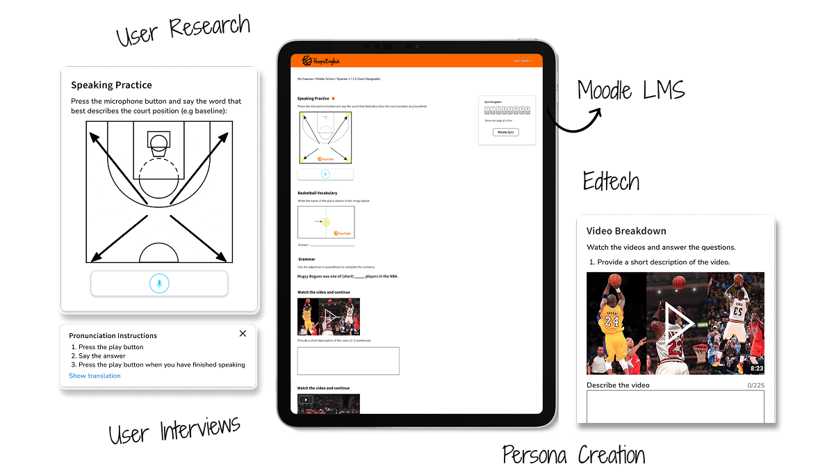
Redesigned and improved the HoopsEnglish language learning platform, enhancing its user interface and user experience to cater to basketball fans learning English. Focused on improving activity layouts, addressing cognitive overload, and resolving conflicts between user preferences.

.02 - How

Conducted user research and usability testing to identify key pain points. Designed iteratively, improving visual hierarchy, offering customizable gamification options, prioritizing speaking activities, and streamlining content. Developed front-end components for better user interaction.

.03 - Why

The goal was to make learning English through basketball more engaging and intuitive, addressing usability issues, user engagement challenges, and conflicting user preferences. Simplifying the interface and activities was key to increasing adoption and satisfaction.

Results

Increased user adoption and positive feedback from users. Simplified lesson layouts with reduced cognitive overload. More engaging speaking activities and reduced reliance on time-intensive video analysis.

Process

Exploration + Research

  • Kicked off with strategic market research analyzing Duolingo, Babbel, Rosetta Stone.
  • Using SWOT analysis, Identified gaps HoopsEnglish could uniquely fill. Opportunity found: blend of sports + language = untapped niche.
  • Conducted user research in phases. First phase served as an opportunity to watch, listen, and learn from users through user interviews.
  • Synthesized data into themes and design priorities. Presented findings to stakeholder resulting in alignment across product, education, and dev teams.

Design Approach

  • Design phase focused on MVP, not perfection. The focus was placed on testing concepts quickly—not high-fidelity visuals.
  • Adopted lean UX strategy creating and annotating wireframes keeping designs clean and clear (functional fidelity) to communicate ideas fast.
  • I leaned on online resources to move faster—icons from The Noun Project, media assets from Unsplash, and even some quick CSS snippets to demo UI behavior demonstrating adaptability and iterative design process.

User Feedback

  • Phase two of user research focused on validating designs through usability testing.
  • I observed how users interacted with updated flows and layouts: where did they click? What made them pause? What activities gave a sense of accomplishments?
  • Each change was tested, tweaked, and re-tested. It was a cycle of continuous feedback, and it worked. This phase didn’t just improve the product—it made users feel heard and stakeholders feel confident.

Results

Impact

  • Redesigned the interface with a cleaner layout.
  • Prioritized visual hierarchy and removed clutter reducing cognitive load.
  • 100% of test participants praised the updated layout for clarity and usability.
  • Created a feedback loop that boosted user trust and platform engagement.

Designs

Back to Top

Ready to push your product forward?

LET'S GET STARTED
Book a Call

“ Our team needed extra help to get us through our busy conference promotion season. Jeo helped us with two key UI/UX redesigns and kept us afloat with our day-to-day web updates. From day one, Jeo brought his professionalism, sharp thinking, and warm personality, making him a key part of our success in these critical weeks... ”

Reyna F.

Strategic Creative Director

© Copyright 2025 | Jeovanny Tovar | All Rights Reserved